Footfall data and York festivals – a case study
I was disappointed when I ran an analysis of York’s Open Data and didn’t find a dramatic correlation between cultural events in the city and the available data on 2023 retail footfall. But it led to deeper reflection and inquiry on whether a footfall count, on its own, is helpful as a storytelling tool.
In September 2023, at York’s Radisson Hotel, I sat in the audience for Reignite, which brought together the city’s creative, retail, and hospitality sectors. Its ambition was to make more of the city’s UNESCO designation as a City of Media Arts by emphasising the economic impact of culture. I was reminded of the event when browsing the City of York’s Open Data repository. I found a table of footfall data captured on retail-dense streets. It was updated hourly, with hundreds of thousands of entries from 2009 to the present. I thought it would be fun to analyse this dataset alongside the city’s festival calendar.
I’ll say right off the bat that this case study is primarily a homework exercise for my Google Professional Certificate in Data Analytics, and it isn’t endorsed or commissioned by anyone. It’s a reflective personal project intended only as a conversation starter about measurement methods and using data to tell stories.
What did I make?
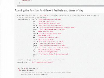
I developed an R program that, in one click, pulls in the complete footfall data, filters it, and generates 72 individual graphs with colour-coded plots. These show footfall counts at four times each day during eighteen different festivals in York in 2023. The program outputs an annotated HTML file embedded with JPGs of all the charts. On top of that, it saves 72 vector versions of the charts in a separate folder. These are layered and editable: the fonts, colours, and layouts can be manually re-designed and then animated with software like Adobe Illustrator and After Effects. I edited four vector outputs this way to create the easier-to-read graphics later in this blog. But here’s an animated GIF showing the initial generated output:
Method
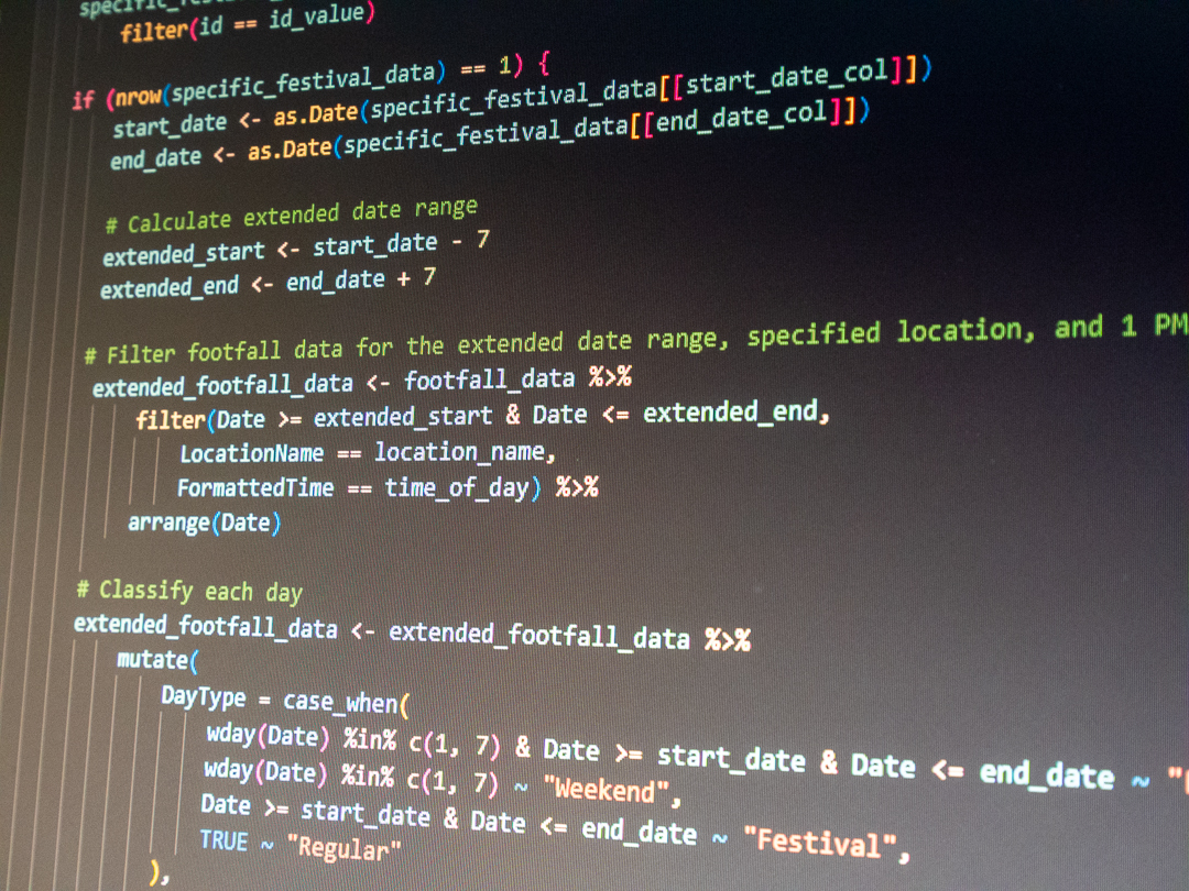
When I downloaded the dataset, it contained 398,857 rows of data. I wanted to code a function that accepted a festival name as input to get a useful visualisation as output. I assembled a list of York’s festivals and assigned each an ID. So, if I’d type ‘asff’ when calling the function, it would return a visualisation of footfall during the Aesthetica Short Film Festival.
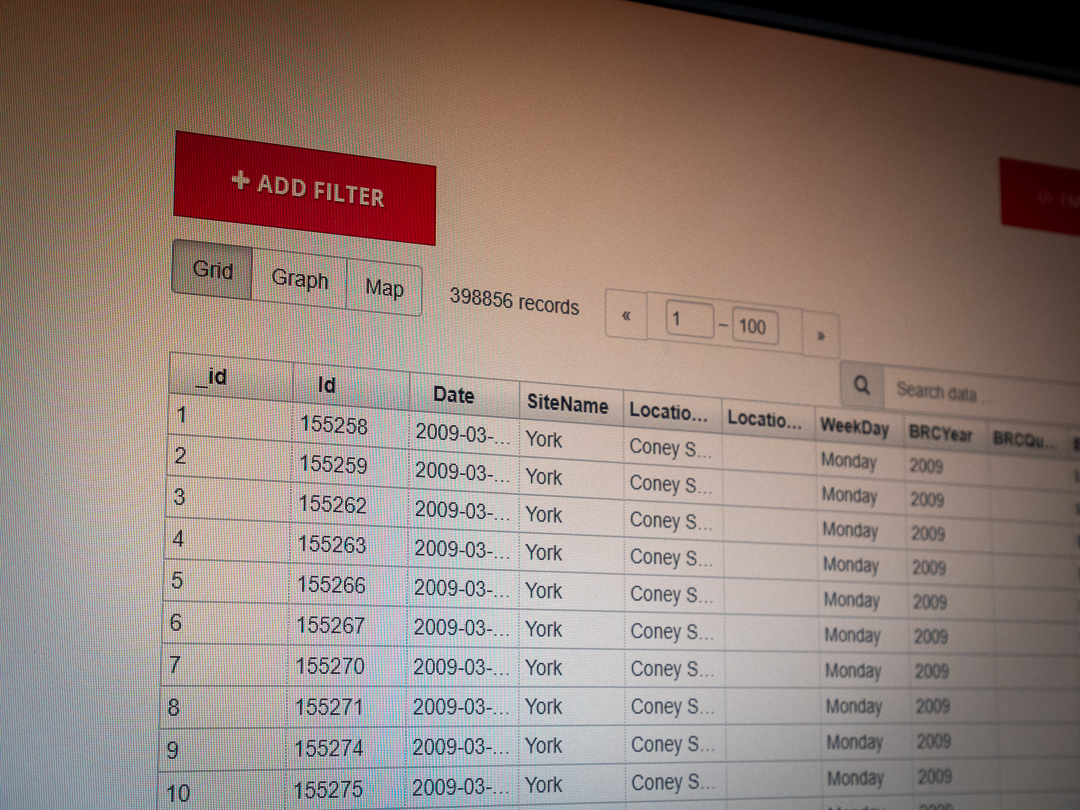

I had to establish boundaries. I limited my analysis to 2023 and footfall on just one street. The dataset holds over a decade of information, and different combinations of streets were surveyed in different years. For 2023, it only has data for two streets in York: Mickelgate and Parliament Street. I chose Parliament Street because of the density of retail activity there. It also connects to other retail-dense streets in a way that Mickelgate does not. So, when I talk about footfall, remember that I’m not talking about it city-wide — a lot of activity isn’t recorded.
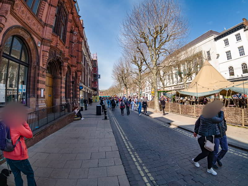
Suppose you’re not familiar with York in the UK. Parliament Street is wide and mostly pedestrianised. It has familiar shops like Marks & Spencer and Pret A Manger. It’s where the Christmas Market takes place in December, and it hosts temporary attractions like food tents and includes an entrance to Shambles Market. Here’s a photo from April 2021:
I wanted my code to generate separate graphs for different times of day: 10am, 1pm, 4pm, and 6pm. I picked these because they felt like a satisfying spread of time to analyse. I also wanted the graphs to highlight all weekends and to display data for the weeks on either side of the festivals so I could observe differences.
Analysis
After iterating the code, I reviewed the generated images. I saw that a rise in Parliament Street foot traffic sometimes correlated with festival dates. But often, the changes were negligible and inconsistent. It’s hard to tell what the real impact was. Let’s begin with a dramatic correlation, the York Ice Trail, where ice sculptures pop up and wow visitors for a Winter weekend.
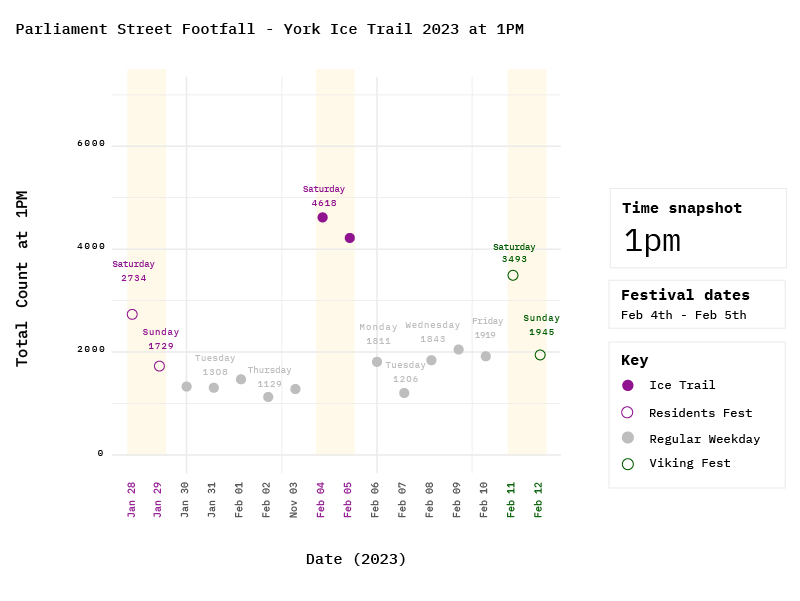
You can see that the Ice Trail dates correlate with a significant rise in footfall. But what’s curious is what happens on the weeks either side. Look at the weekend before the ice trail. That was the York Residents Festival, when tourist attractions are discounted or free to York residents. That weekend didn’t correlate with the same spike as the ice trail. And the weekend after the ice trail—the start of the Jorvik Viking festival—correlates with numbers between the two. From my memory of the ice trail, most of the ice sculptures in 2023 were on Parliament Street itself, which would explain the spike. But how different are these numbers from regular weekends?
Are spikes in footfall a valuable marker of economic impact?
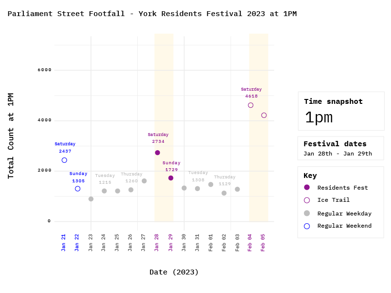
The image below is similar but shifts focus to the Residents Festival, where we’ve already seen that at 1pm, the total count was 2734 people on Parliament Street. But on the regular weekend before that, the count was 2437. That’s not the same magnitude of change we saw on the Ice Trail and Viking Festival dates.
Is it worthwhile to compare numbers like this when we want to know the economic impact of these festivals? During the Ice Trail, 4618 people were counted at 1pm. But I can’t tell you what they did, what they spent, or where they spent it. Maybe four thousand people admired the ice sculptures, ate packed lunches on a bench, and walked home spending nothing. Or perhaps they all queued for a £5.10 Salted Caramel Frappé at Costa, then popped into Tag Heuer to drop five grand on a watch. The data doesn’t tell us much about this activity. And we can’t prove that it’s the festivals drawing crowds either. It might be a coincidence.
Was it really the festivals that brought people onto Parliament Street?
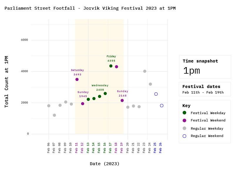
The following image focuses on the Jorvik Viking Festival, correlating with more footfall on Parliament Street. But Valentine’s Day also took place that week. And some schools had a half-term holiday, which could also be a factor. I imagine families took advantage of the half-term break to see the Vikings in York. But I can’t prove it with the footfall data.
I included sports events to see how they’d correlate.
The football stadium and racecourse are both outside the city centre. But York visibly fills with racegoers on race days. My results showed that the Dante Festival (horse racing) correlated with a Saturday lift in foot traffic on Parliament Street. But the Ebor festival (also horse racing) did not. Those are events where cameras on Mickelgate, with its many bars and alignment with a route from the racecourse, might show more uplift. The UK Snooker Championship occurs just outside the city walls in York Barbican. But because it takes place in the run-up to Christmas, it’s hard to know who’s on Parliament Street on their way to the snooker and who’s there for the Christmas Market.
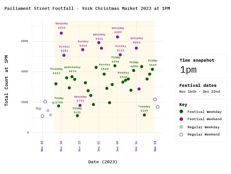
The Christmas Market has the most dramatic correlation.
The Christmas Market, which takes place on Parliament Street, correlates with significantly higher footfall every day of the week, with hourly counts often of 5000 or more.
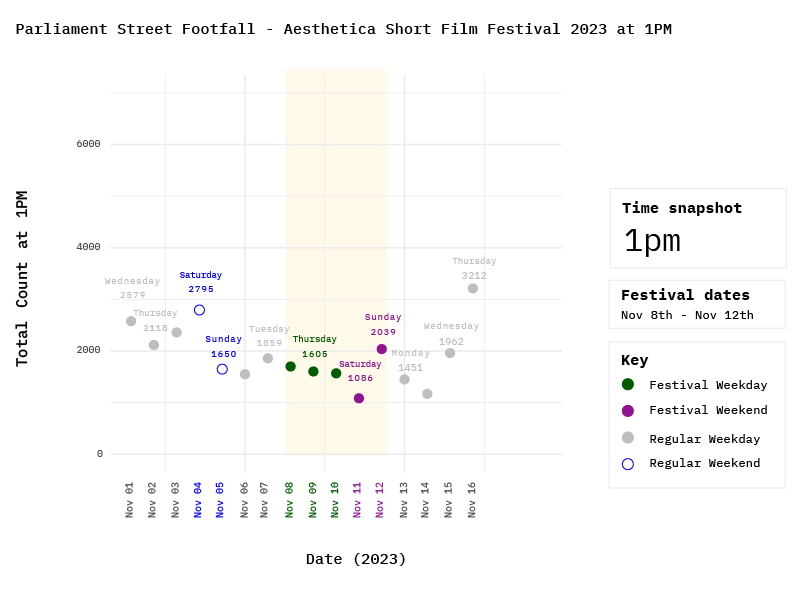
I was interested in seeing data for the Aesthetica Short Film Festival.
I often attend the Aesthetica festival. It’s influential in the global film festival calendar. The ASFF brand is visible in York during the festival as attendees walk from venue to venue with lanyards and tote bags. It’s a success story. And yet, it doesn’t obviously correlate with footfall in Parliament Street. But then why would it? I can’t think of a screening venue on that street. And does it matter? Many walking routes to the screening venues are densely packed with shops and eateries that could benefit from the footfall. I don’t have data for those streets. But if I did, it still wouldn’t tell me if the festivalgoers are pausing to buy things between screenings. Footfall isn’t a helpful measure of retail impact here, either.
Are these actionable insights?
Parliament Street’s footfall didn’t change much during a lot of the remaining festival dates I analysed. These footfall counts prompt a different question: why don’t we see more people on Parliament Street during festivals if it’s assumed there are more people visiting the city to attend its cultural events? What could attract them to the street? Could different data and methods help businesses synchronise offerings and opening times with opportune days of the year? Could scheduled visual advertising outside the home, and on social media, draw visitors from festival areas to Parliament Street? Could branded content on TikTok and Instagram, relevant to the festivalgoer interests, be optimised to attract them onto the street?
As I said earlier, this blog post is a homework exercise and a conversation starter. Analysts in York will have been looking at these data for years, and I’m not looking to reinvent the wheel. My humble conclusion is that the footfall data alone doesn’t show causation. The streets included in the 2023 dataset are limited, and a lot of the city’s foot traffic isn’t recorded. Footfall alone doesn’t show us retail sales during these festivals. It doesn’t show festival attendance, visitor demographics, fulfilled intentions, or abandoned desires. If I were to design this project with more time and resources, then I’d gather contributions from local retail sector subject matter experts and business owners in York for their perspective on reading footfall counts and ground-level knowledge of what’s happening day-to-day.
And what do I think about my own process?
I’m proud that I designed and wrote this R program, but it could be improved. The generated graphs already have colour coding and styling. Still, I had to do manual design work in Adobe Illustrator afterwards to make the graphics easier for a new viewer to understand. There’s space for an extra step in the process. After generating the outputs, I could manually redesign one of them. Then, I could create a new iteration of the code, focusing on the styling, and aim for the generated graphics to match my improved manual design. I’d also like to try automating animation to show changes in footfall at different times of the day.
If I wanted to improve the program’s efficiency, I’d also automate one of the cleaning steps. The date and time in the original dataset were mixed together. During data cleaning, I used a spreadsheet formula to separate them into new date and time columns and saved a new file for the R code to access. But it would be more useful for the R code to split the columns on its own, so that the code could be re-run on updated data without requiring that extra action.
This is all I’m going to do with this dataset for now. I learned a lot from the exercise, and I’m pleased to say that I have obtained my Google Professional Certificate in Data Analytics! I learned a lot of new skills and methods, and I’m excited to tell more stories with and about data.
References
York Open Data – Hourly Footfall
Note
This post was published on 10th January, and I updated it on 12th January because I had another thought to add.